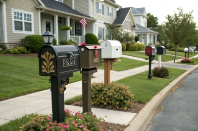
1. Vertical Lettering Layout
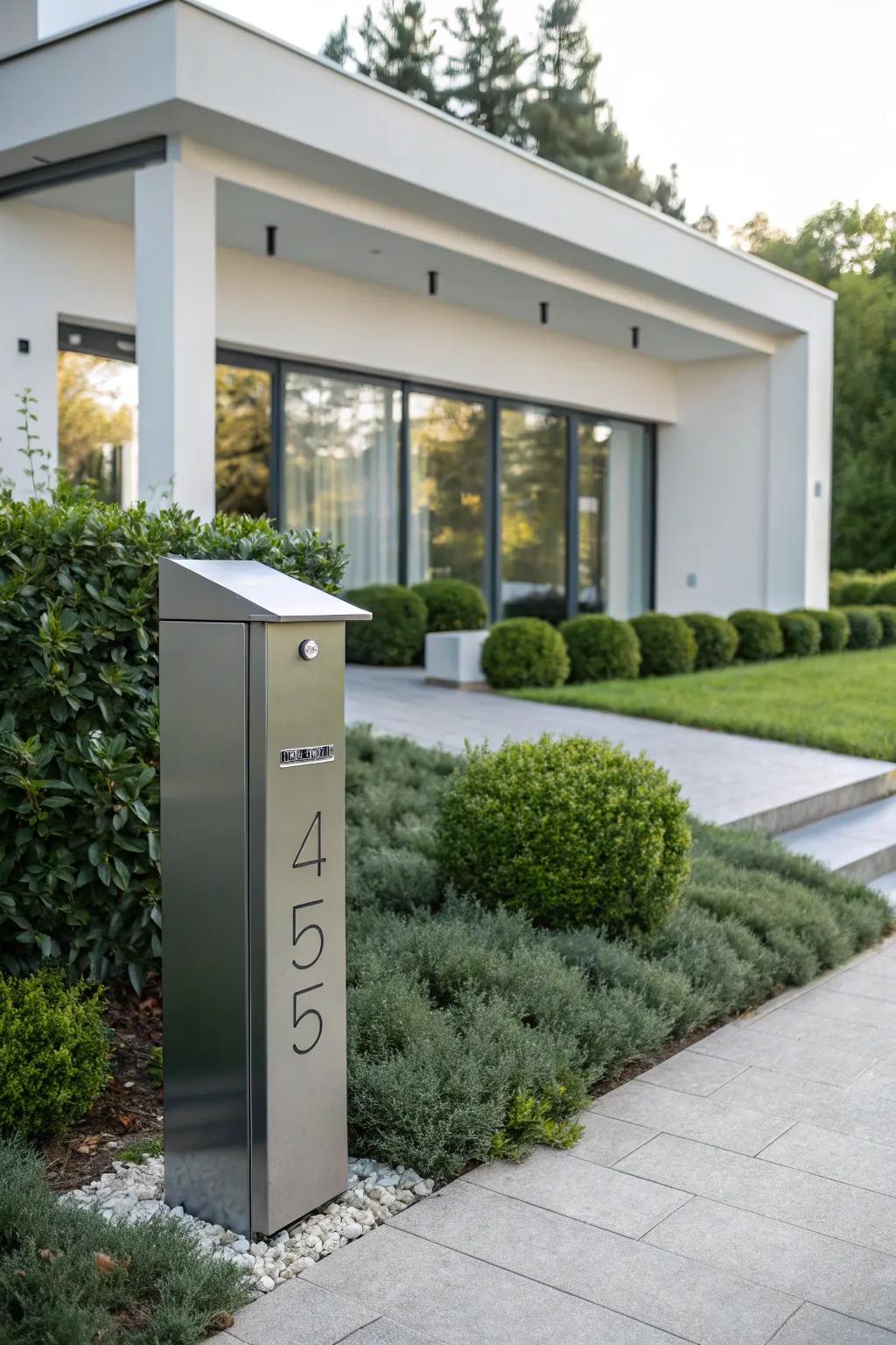
For a modern twist, try a vertical lettering layout. It’s a sleek and contemporary option that stands out from the traditional horizontal style.
You might give these a try:
- Vertical Mailbox Number Stickers: Enhance your mailbox with durable vertical number stickers. Easy to apply and weather-resistant.
- Custom Vertical House Address Plaque: Personalize your space with a custom vertical address plaque. Sleek design for a modern look.
- Vertical Adhesive Lettering Strips: Upgrade your mailbox with adhesive lettering. Simple installation with a contemporary appearance.
2. Reflective Lettering for Night Visibility
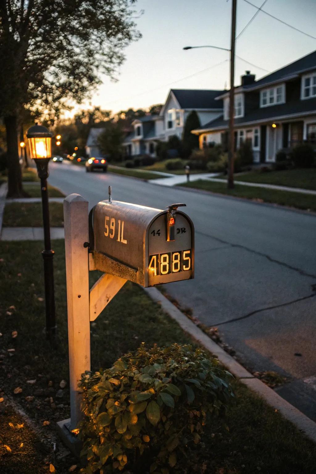
Consider using reflective lettering for enhanced visibility at night. It’s a practical choice that ensures your address is always easy to find, day or night.
A few things you might like:
- Reflective Mailbox Numbers: Enhance visibility with reflective mailbox numbers, making your address easy to spot at night.
- Reflective Address Stickers: Illuminate your mailbox with reflective address stickers for distinctive night-time visibility and appeal.
- Self-Adhesive Reflective Lettering: Apply self-adhesive reflective lettering easily to ensure your mailbox is visible in low light.
3. Bold Family Name Display
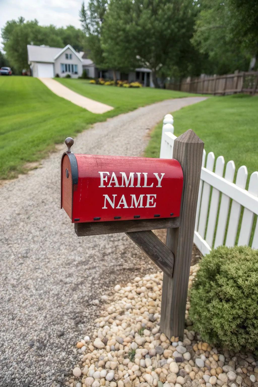
Imagine your family name boldly displayed on your mailbox, greeting visitors and passersby with a personal touch. This simple addition can transform your mailbox into a charming landmark.
Try these:
- Custom Vinyl Lettering: Make your mailbox stand out with bold, personalized vinyl lettering for a distinct touch.
- Weatherproof Mailbox Decals: Ensure longevity with durable, weatherproof decals that keep your family name visible year-round.
- Magnetic Mailbox Covers: Easily update your mailbox look with stylish magnetic covers showcasing your family name.
4. Distinctive Font Choices
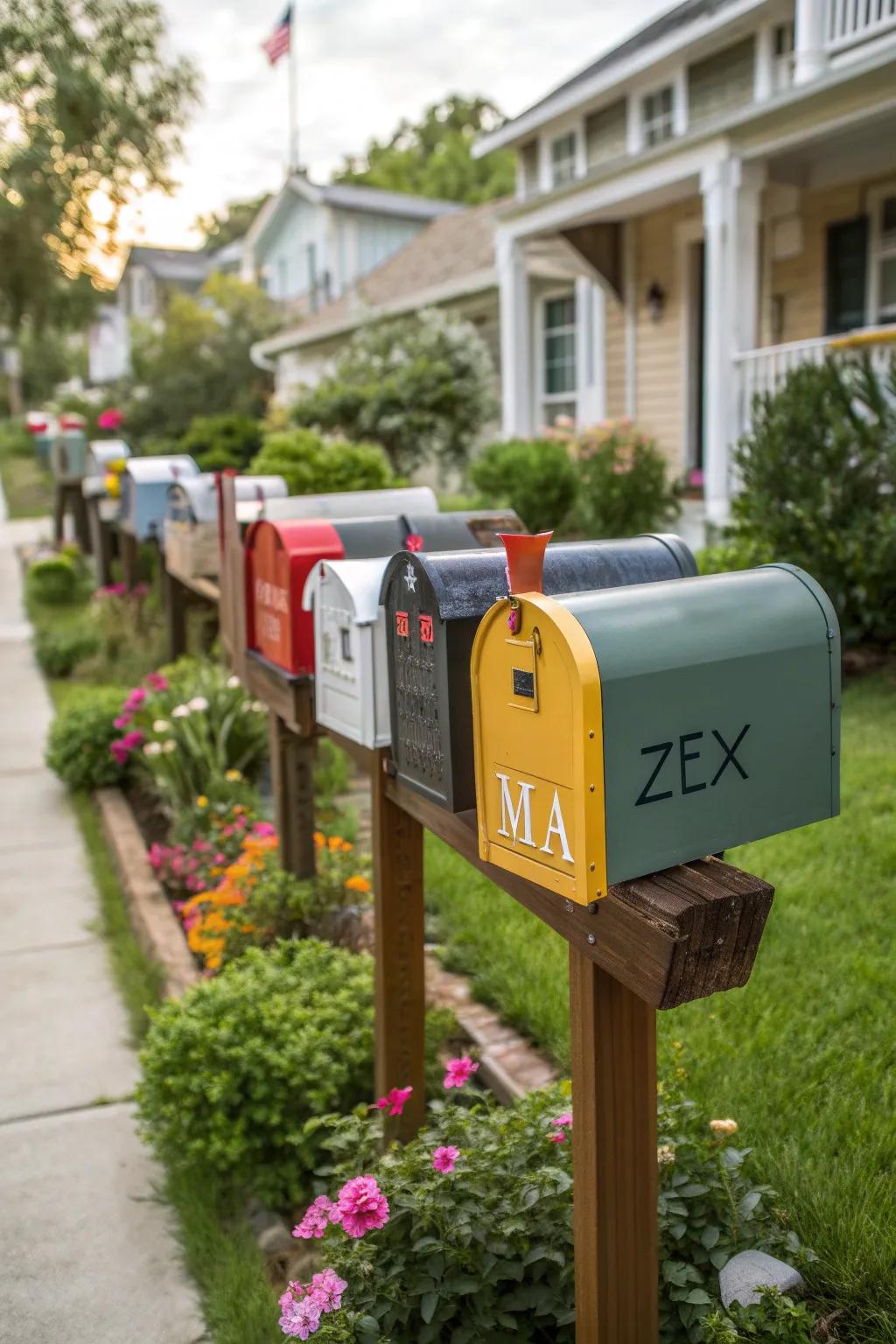
Choose a distinctive font that reflects your personality and complements your home’s style. It’s amazing how a font can change the entire vibe of your mailbox!
Products that could assist:
- Vinyl Mailbox Lettering Decals: Transform your mailbox with easy-to-apply vinyl decals in distinctive fonts that express you.
- Custom Metal Lettering for Mailbox: Enhance your home’s curb appeal with personalized metal letters in a variety of stylish fonts.
- Reflective Mailbox Number Stickers: Stay visible day and night with reflective number stickers featuring elegant font options.
5. Decorative Flourishes
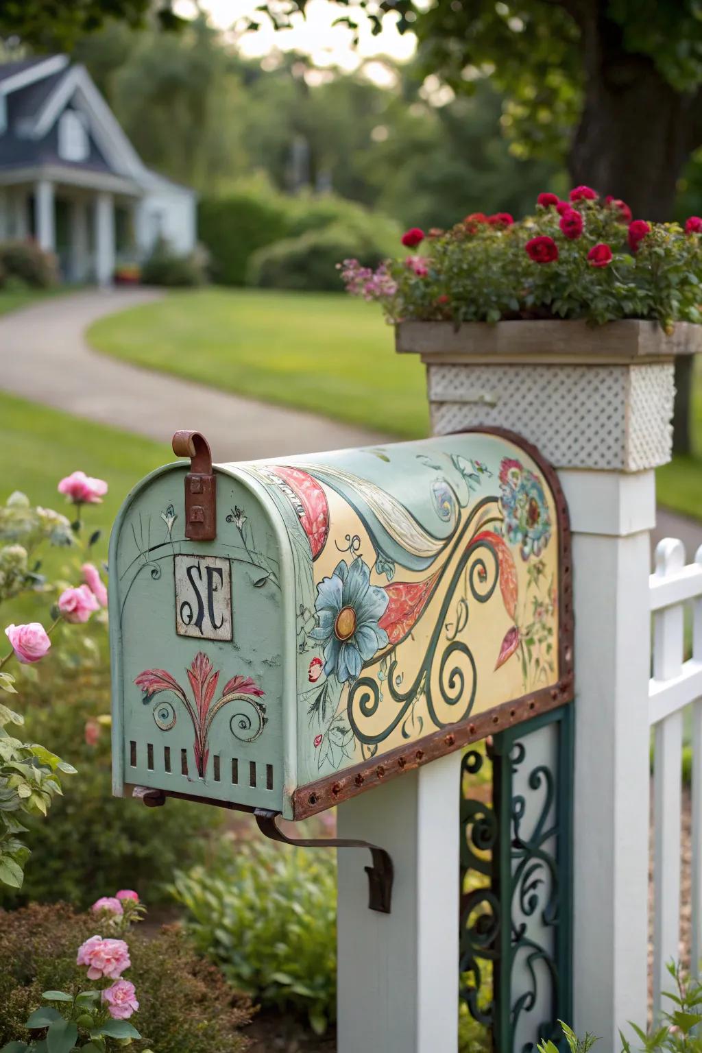
Add some flair to your mailbox with decorative flourishes. These little details can make a big impact, turning a functional item into a piece of art.
Give these a look:
- Metallic Mailbox Decals: Transform your mailbox with elegant metallic decals. Effortlessly add charm and personalization.
- Floral Stencil Kits: Use floral stencils to create intricate designs on your mailbox, adding a personal artistic touch.
- Outdoor Mod Podge: Seal and protect your decorative mailbox with weather-resistant outdoor Mod Podge for lasting vibrancy.
6. Elegant Address Numbers
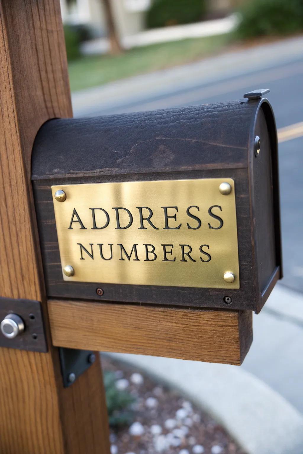
Clear and elegant address numbers add a touch of sophistication to any mailbox. They’re not just practical; they’re a stylish way to ensure your home is easily identified.
These products might help:
- Brass Address Number Plaques: Enhance your mailbox with sophistication using elegant brass address number plaques.
- Classic Metal Address Numbers: Add a timeless touch to your mailbox with classic metal address numbers.
- Gold Finish Address Numbers: Achieve an upscale look with these refined gold finish address numbers for any mailbox.
7. Rustic Charm
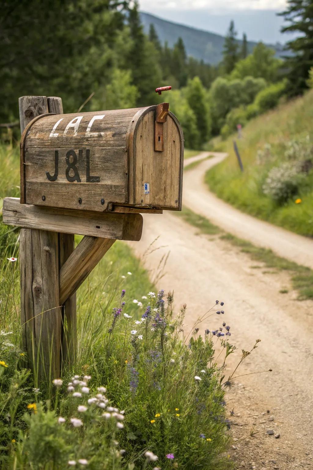
For a touch of country charm, opt for rustic lettering on your mailbox. It pairs perfectly with natural materials and a cozy home vibe.
A few suggestions:
- Rustic Mailbox Lettering Stencils: Create your own rustic charm with easy-to-use stencils. Personalize your mailbox effortlessly.
- Vintage Style Wooden Numbers and Letters: Add a vintage touch with wooden numbers and letters. Enhance your mailbox’s rustic vibe.
- Outdoor Weatherproof Adhesive Vinyl Letters: Ensure longevity with weatherproof vinyl letters. Perfect for outdoor charm with rustic elegance.
8. Nature-Inspired Designs
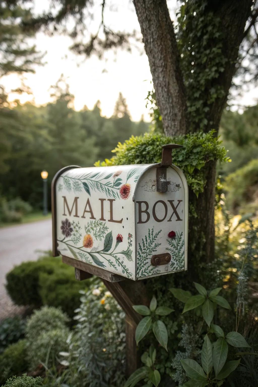
Incorporate nature-inspired designs into your mailbox lettering for a serene and organic look. It’s a great way to reflect your love of the outdoors.
Consider these options:
- Floral Mailbox Decals: Enhance your mailbox with elegant floral decals that blend seamlessly with nature’s backdrop.
- Nature-Themed Stencils: Create custom nature-inspired lettering with easy-to-use stencils for a unique mailbox appearance.
- Outdoor Weatherproof Paint: Ensure your mailbox design lasts with durable, weatherproof paint perfect for outdoor use.
9. Classic Monogram
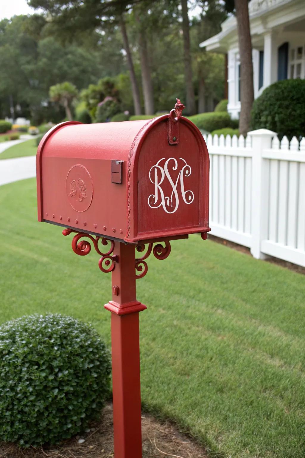
A classic monogram adds a touch of elegance and personalization to your mailbox. It’s like giving your home its own stylish signature.
A few helpful options:
- Self-Adhesive Vinyl Monogram Decals: Enhance your mailbox with elegant self-adhesive decals, adding a personalized touch easily.
- Weatherproof Magnetic Monogram Letters: Opt for magnetic letters offering a durable, stylish, and easily changeable mailbox decoration.
- Customizable Reflective Monogram Stickers: Get noticed day or night with reflective monogram stickers, ensuring visibility and charm.
10. Colorful Lettering
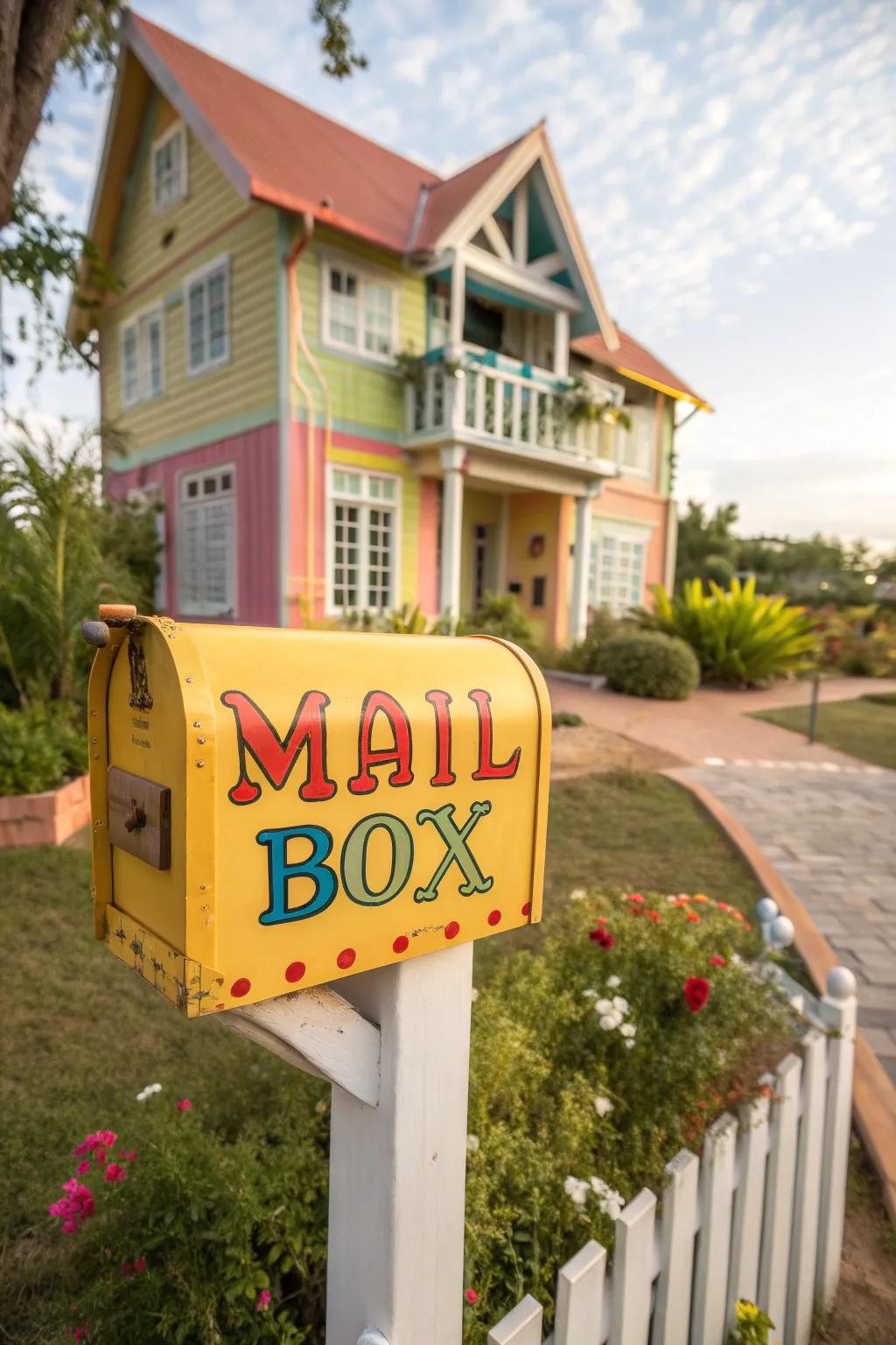
Why stick to black and white when you can have colorful lettering? Match your mailbox lettering to your home’s exterior color scheme for a cohesive look.
Possibly handy products:
- Outdoor Vinyl Letter Stickers: Brighten your mailbox with vibrant vinyl stickers. Easy to apply and weather-resistant for lasting appeal.
- Acrylic Paint Set for Outdoor Use: Create personalized designs with an array of durable acrylic paints, perfect for weatherproof mailbox art.
- Multi-Color Permanent Markers: Add durable, colorful details to your mailbox with these weather-resistant permanent markers.
11. Pop of Metallic
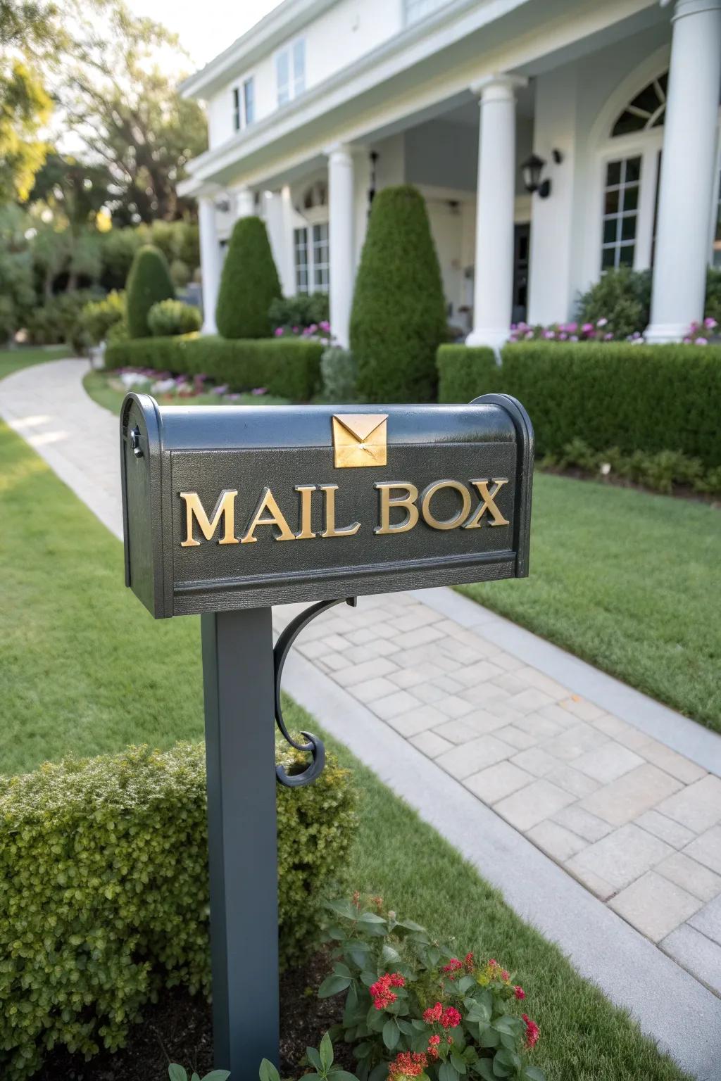
Add a touch of glamour with metallic lettering. Gold, silver, or copper can turn your mailbox into a subtle yet sophisticated statement piece.
Useful items to consider:
- Gold Adhesive Mailbox Numbers: Elevate your curb appeal with gold numbers that shine in any light. Easy to apply.
- Copper Metallic Vinyl Letters: Transform your mailbox with copper letters for a bold, stylish statement. Durable and weather-resistant.
- Silver Reflective Mailbox Decals: Get noticed with silver reflective decals for your mailbox. Ensure visibility day or night.
12. Seasonal Themes
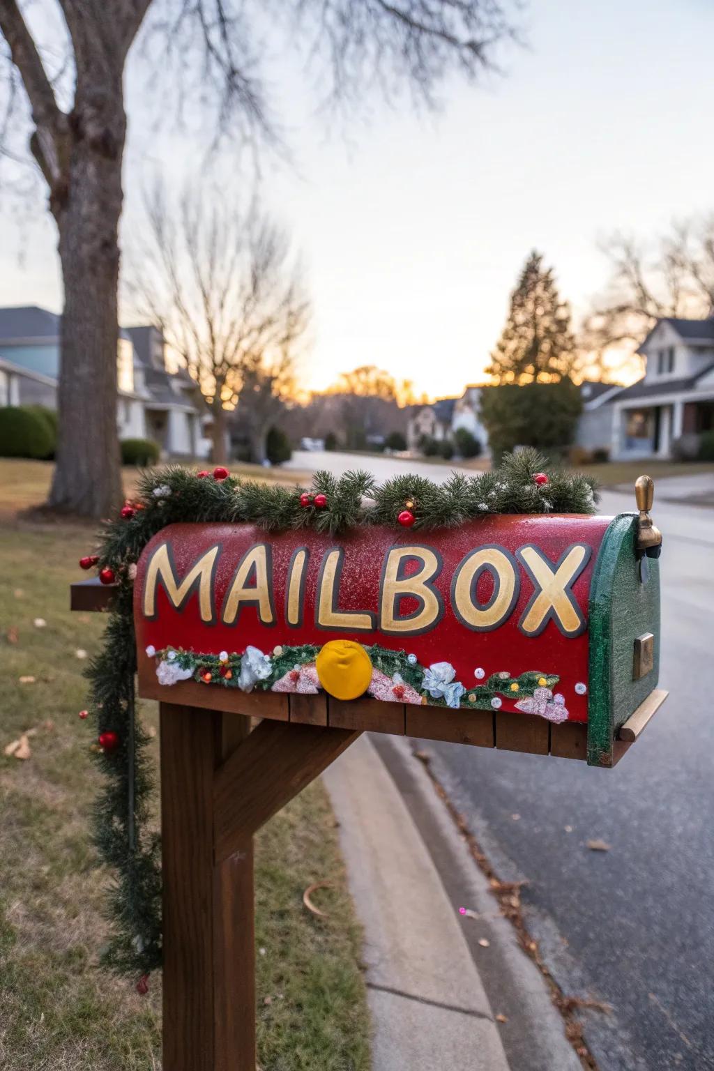
Switch things up with seasonal themes in your mailbox lettering. It’s a fun way to celebrate holidays or changes in the season.
These products might be useful:
- Seasonal Mailbox Covers: Decorate your mailbox with festive covers for each season. Enjoy vibrant transformations year-round!
- Magnetic Holiday Decoration Sets: Easily switch out decorations for any holiday with these convenient magnetic sets. Celebrate in style!
- LED Decorative Lights: Add sparkle to your mailbox with LED lights. Highlight your decorations day and night!
13. Eco-Friendly Materials
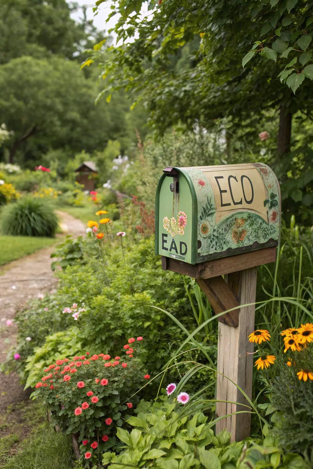
Go green with eco-friendly materials for your mailbox lettering. It’s a great way to show your commitment to sustainability while still looking stylish.
Check if these fit your needs:
- Recycled Metal Mailbox Letters: Create a stylish mailbox with recycled metal letters, showcasing your commitment to sustainability.
- Biodegradable Lettering Stickers: Enhance your mailbox with biodegradable lettering stickers, adding an eco-friendly touch to your home.
- Bamboo Engraved Letters: Add a natural aesthetic with bamboo engraved letters, providing a sustainable option for mailbox decoration.
14. Minimalist Approach
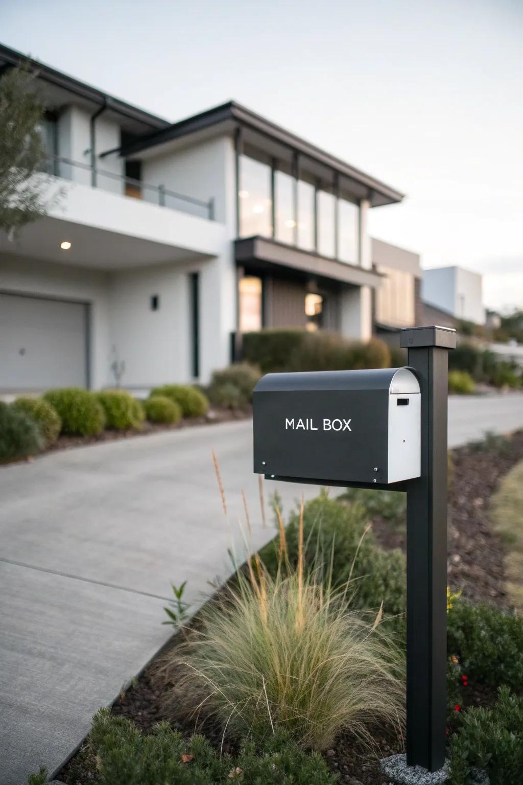
Sometimes, less is more. A minimalist approach with simple, clean lines can make a striking statement on your mailbox.
Might be a good match:
- Vinyl Mailbox Lettering Decals: Enhance your mailbox with sleek, weatherproof vinyl decals for a clean, modern look.
- Magnetic Number Stickers: Easily update mailbox numbers with elegant magnetic stickers designed for convenience and style.
- Personalized Mailbox Address Plate: Transform your mailbox with a custom, minimalist address plate for a striking visual upgrade.
15. Customized Quotes
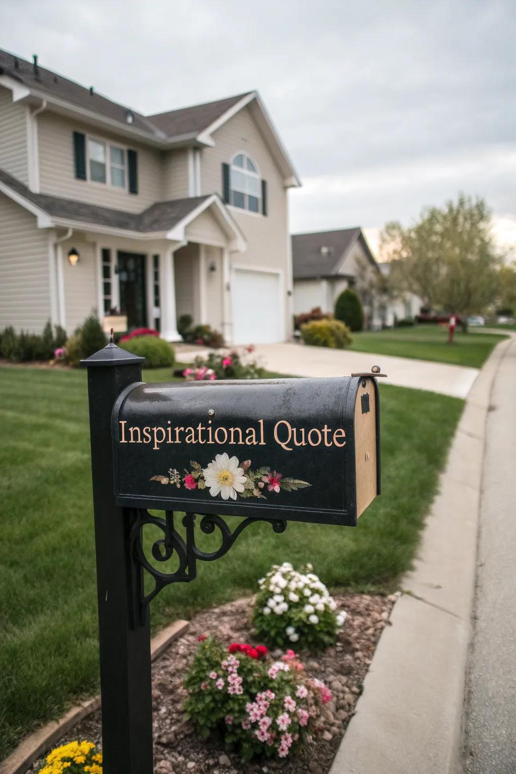
Inspire your neighborhood with customized quotes on your mailbox. Whether it’s a motivational phrase or a family motto, it adds a personal and thoughtful touch.
Some ideas to consider:
- Vinyl Lettering Decals: Transform your mailbox with easy-to-apply vinyl decals that offer durability and style.
- Customizable Mailbox Numbers and Letters: Personalize your mailbox with elegant customizable numbers and letters for a unique touch.
- Outdoor Waterproof Paint Pens: Create detailed designs on your mailbox with vibrant, weather-resistant paint pens.
16. Vintage Vibes
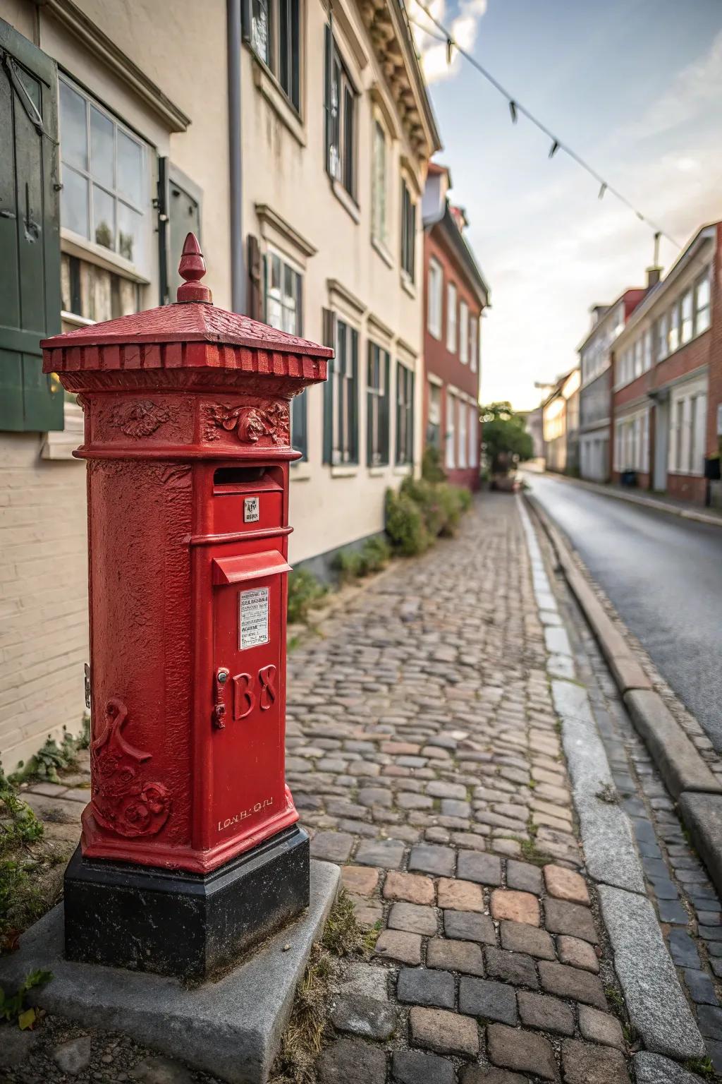
Embrace nostalgia with vintage-inspired lettering. This style adds character and a sense of history to your home’s exterior.
May just do the trick:
- Vintage Style Metal Mailbox Numbers: Add character to your mailbox with these vintage-inspired metal numbers, enhancing nostalgic appeal.
- Antique Finish Letter Stencils: Create a charming retro look with these stencils, perfect for a classic mailbox makeover.
- Classic Victorian Mailbox Lettering Decals: Transform your mailbox with Victorian decals, adding elegance and historical charm effortlessly.
17. Playful Patterns
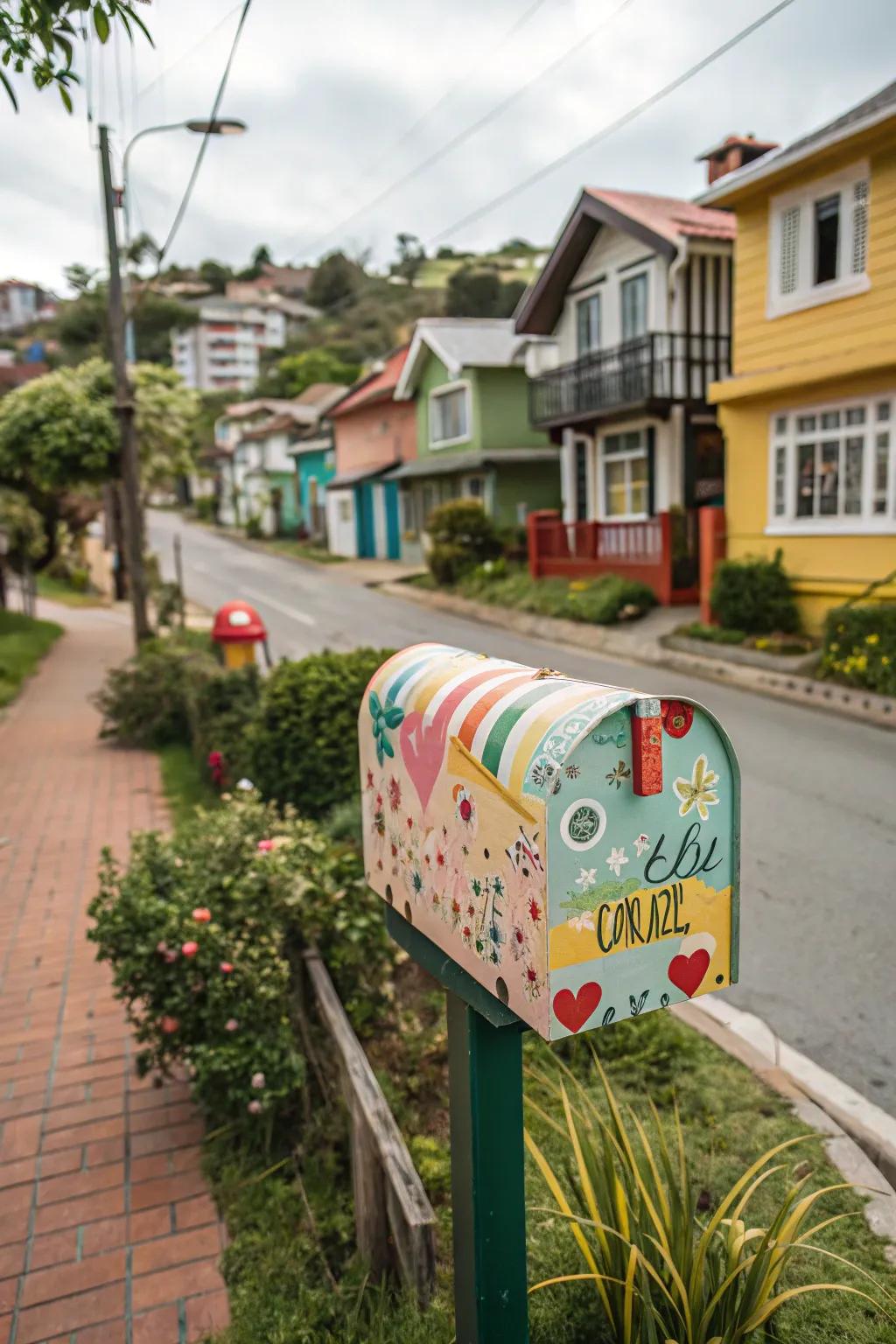
Add some fun with playful patterns in your lettering. Stripes, polka dots, or even chevrons can bring a lively vibe to your mailbox.
Some handy options:
- Colorful Vinyl Lettering Sheets: Brighten your mailbox with colorful vinyl lettering sheets. Easy to apply for a playful design.
- Patterned Washi Tape Set: Add fun textures and patterns with a vibrant washi tape set. Perfect for creative details.
- Stencil Set for Patterns: Use stencils to create playful patterns on your mailbox. Achieve perfect stripes or polka dots.
18. Whimsical Script
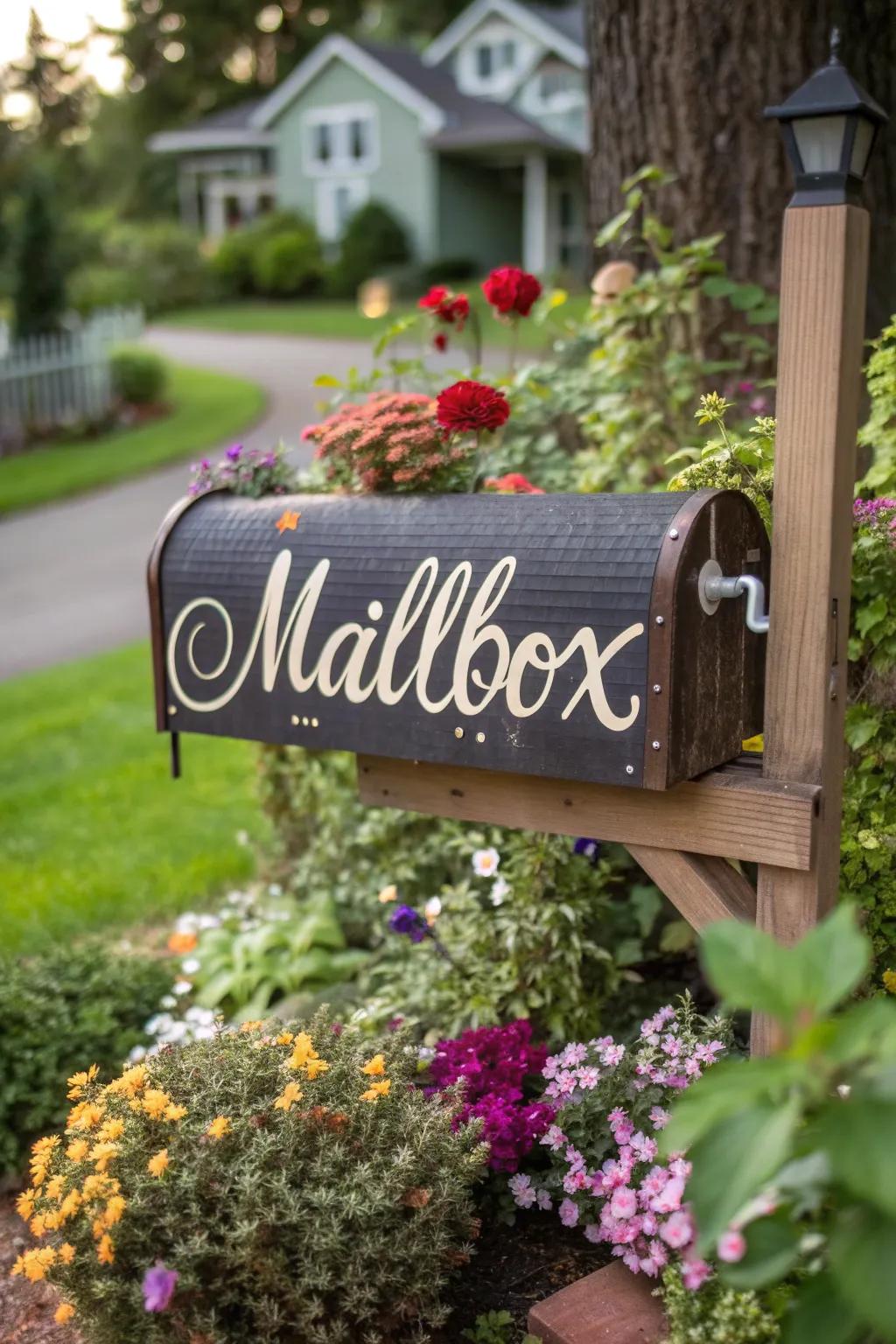
Add a bit of whimsy to your mailbox with a script font. It’s playful, charming, and perfect for those who want to add a little fun to their curb appeal.
You might like:
- Vinyl Script Lettering Stickers: Transform your mailbox with these playful vinyl script stickers for a touch of whimsy today.
- Magnetic Mailbox Covers with Script Font: Add charm with a magnetic mailbox cover featuring whimsical script fonts; easily changeable anytime.
- Waterproof Script Lettering Decals: Enhance curb appeal using waterproof script decals; durable and perfect for any weather conditions.
19. Geometric Precision
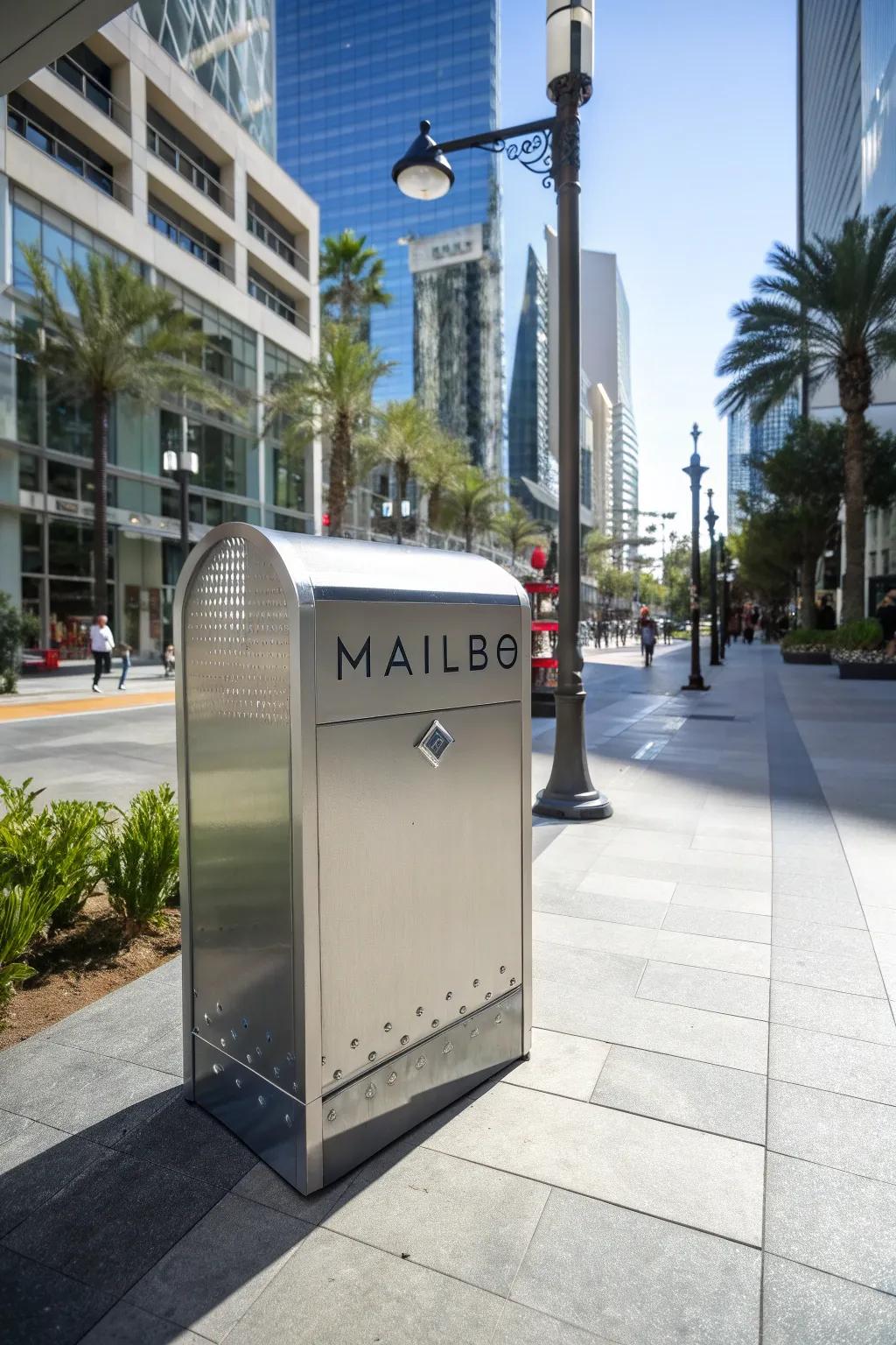
For a modern aesthetic, consider geometric precision in your lettering. Sharp lines and angles can create a striking, contemporary look.
A few relevant products:
- Vinyl Lettering Kit: Create sleek, modern mailbox labels effortlessly with precision-cut vinyl lettering kits.
- Stencil Set with Sharp Angles: Achieve geometric precision on your mailbox using a high-quality stencil set.
- Metallic Finish Spray Paint: Transform your mailbox letters with a contemporary look using metallic finish spray paint.
